Monday, October 22, 2012

Garamond is my favroite typeface!


As read through this week’s chapter I wasn’t finding myself particularly inspired to continue any research for my blog. It wasn’t until the near the end of chapter 10 when I found that the art and crafts movement had inspired the American Type Founders Company (ATF) to revitalize many Victorian era typefaces. Garamond caught my eye because I have always had a fondness for using it in my own documents—every paper I ever wrote in college, as well as the technical reports I write at work are in Garamond—the Microsoft and Adobe versions that is. I started to ask myself why I am so drawn to this font and began observing my reactions to and searching the internet for details on Garamond.

At first glance Garamond appears to be any old common serif typeface like Times New Roman or Courier but when I look closer I realize there’s a simple elegance to it. Garamond is proportioned well; the letters are not too thick, not too thin. The more vertical letters are, especially ones that reach below the line, are slightly elongated and give them a little drama without being brash. The round letters are very round and the tall letters are slim which keep the lines clean. The best part of Garamond has to be the capital J though and how it reaches below the line like a lower case j (my name is Jeff and this gives my typed name some character).

I found a handy website, indenifont.com, which allowed me to search for various versions of Garamond and I got sucked in to comparing the different versions. The first (below) is the original, by Claude Garamond himself. Most of the serifs are simple and flat except a few like the capital T and the lower case d have and angled serif. I especially like the lower case g and how the lower part appears kinked somewhat.

The next is a very popular version today, Adobe’s version of Garamond (below). Compared to Claude Garamond’s, the serifs are all curved and the top serifs have a cup-like quality. The capital A still has a slight angle at the top but the lower case g is not kinked as I pointed out above.


Here we have a “elegant Garamond,” published by Bitstream, which has it’s own take on many of the letters. The proportions are still there which makes it recognizable as a Garamond font, as well as the flat and wide serifs of the original version. But several of the letters have been simplified as in the capital J no longer has the ball at the end as in the previous two examples. 

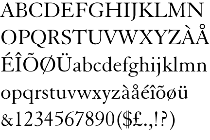
The final example I have is Monotype’s revival version of Claude Garamon’s original. The proportions from thick to thin are not as drastic and the serifs are curved, more like Adobe’s version. I especially like the curved serif on top of the lower case m, n, p and r.


Links:


Monday, October 15, 2012

Why design type?

While reading for module three chapter eight, An Epoch of Typographic Genius, stood out as the beginning of applying artistic design to type and peaked my curiosity on the subject. Image 8-1, which consists of 24 grids and the typographic layout of every letter but W, instantly reminded me of a movie I watched years ago called Helvetica. At the time I was taking a beginning cartography class and we were studying the use of type faces in maps. I remember thinking how I just took the design of type face for granted and how I didn’t really understand what drove typographers to a particular design, so I watched the movie again and will attempt to compare the motivations of typographers. My impression from the chapter and movie in that not unlike art, typography changes with demands which are driven by the trends of the time—typographers constantly want something new and fresh.

Rather the basing type on calligraphy as it was in the very early stages of design, in mid 1600s, under orders from the king, the French mathematician Louis Simoneau sparked a revolution of drafting the design of typeface using a grid. During the rococo era, French artists valued extravagance and detail, and typographers followed this trend forming decorative yet structured fonts using this new type design method. William Carlson, who trained as an engraver, designed type described as “comfortable” and easy to read. During the French Revolution the type that was popularized by kings Louis XV and XIV were rejected and an Italian designer Giambattista Bodoni was on the forefront of the modern era. Bodoni’s style demonstrated a level of precision never scene before, with repeating structure indicative of the advancements in printing. 

Helvetica was invented in post WWII Switzerland when typographers were trying to rebuild a new world through type. They wanted something clean and legible and it caught on fast. Fonts were being created daily for the immense amount of advertising perpetuated by our newly industrial society and the Swiss wanted to infiltrate the mother of this phenomena, the United States. Little did Helvetica’s designers know that they would change the face of advertising. Ads of the 30s and 40s (above) were complicated and busy, with lots of people smiling and fancy fonts explaining complicated slogans. Typeface of the 60s and 70s (above) became sleek and simple, to deliver short messages quickly. There seems to be two outlooks on Helvetica amongst the designers and typographers interviewed in the film. Some think Helvetica is the ultimate san serif font and that all the subsequent san serifs are mere inadequate versions of Helvetica. Post modern designers like Paula Scher often think Helvetica is overused and has become the capitalist font. Scher even describes it as the font that supported the Vietnam War. Rock and roll albums of the 60s and 70s (bellow) best exemplify this trend of moving away from the simplicity of Helvetica, even though it was still very popular.
 
I learned several things have motivated typographers throughout time. Everything from the political climate to artistic trends of the generation, as well as technological advancements and the simple just the urge to create something new, bring about new font designs through typography.