In this week’s reading, the section called The prototype
for the modern map immediately caught my eye because I do a lot of
cartographic design for work and that is the primary reason I’m interested in
graphic design—to make better maps. In this section Meggs introduces the
concept of a cartographic diagram by presenting Henry Beck’s railway map of the
London underground. This was indeed
the first of its kind, where Beck unbound his design from conventional
cartographic rules of orienting the map elements (stations, railways,
landmarks, etc.) according to their actual geographic locations. Instead he
took a different perspective of the usefulness of the map and allowed detail to
be seen where it was needed most by varying the scale within the one map. This
allowed the user to see the busyness of the cluttered railway network of
downtown while keeping the far out reaches of the network on the same page.
Unlike most maps before it (below top), Beck’s diagram includes only one
essential geographic feature for reference (the River Thames) and eliminated
the roads and other confusing features which distract from the purpose of the
map—navigating the railways (below bottom).
Beck’s diagram map continues to influence transit maps
around the world and I will display a few and describe how they continue to use
his innovations. In the Hong
Kong transit maps below, the one on the top shows the actual
extent of the transit system by using the physical location of the rails and
stations but the one on the bottom reduces the distance to the far reaching
legs of the system. This reduction allows the map to show more detail in the center
of the city while only losing detail where it is not needed.
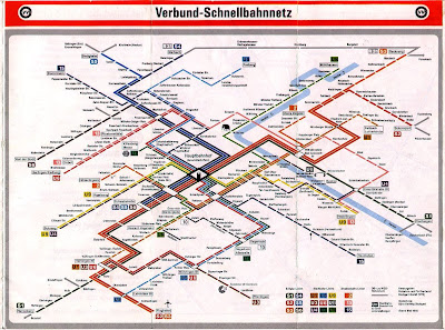
Since this is a graphic design class I should also emphasize
the artistic qualities of Henry Beck’s map that have evolved throughout time. By using only vertical and horizontal lines
and 45 degree angles where the tracks change direction, Beck keeps the graphics
consistent making the map visually pleasing as a whole. In the Stuttgart
transit map below (top) you will notice that the transit lines are drawn only
with 30 degree angles, giving it striking almost 3D effect. Beck also conventionalized
the open circle as a station stop along a transit line in his diagram map. This
can be seen even more drastically against the stunning black background of the Buenos
Aires map below (bottom).
I hope by comparing some of the transit maps
above you will not only appreciate the drastic influence Henry Beck had on converting
transit maps to diagrams, but also understand the practical value and the
artistic merit involved in doing so.
Image sources:
(in order of appearance)
References:
Ovenden, Mark, 2003, Transit Maps of the World, Penguin Books, New York


